Say “Breeze”! Maps Provide Easy-to-Understand Snapshots of Wind Resources
Oct. 14, 2020
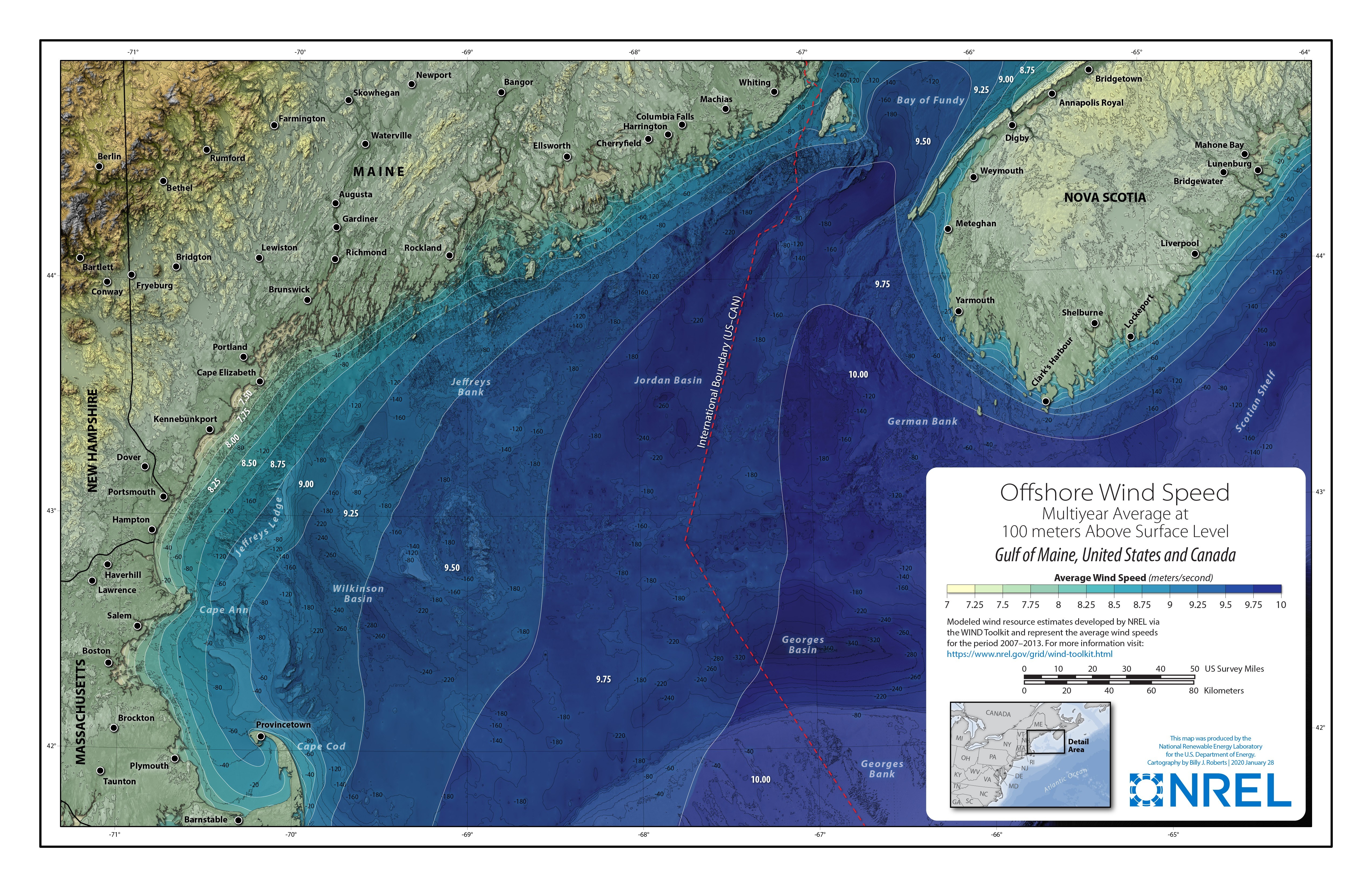
The new wind resource maps, including this offshore map of the Maine coast, make it possible to better understand an area’s comprehensive wind resource potential at a glance. Illustration by Billy Roberts, NREL
Wind is the largest source of renewable energy in the nation, supplying more than 7% of U.S. electricity in 2019. While states are considering shifting even more electricity generation to wind power and other clean energy sources, there are many steps required before putting turbines in the ground. A new series of wind resource maps funded by the U.S. Department of Energy’s (DOE’s) Wind Energy Technologies Office (WETO) and created by experts at DOE’s National Renewable Energy Laboratory (NREL) gives audiences a quick and simple understanding of key considerations when weighing wind power options.
When developers plan a new wind plant, they use detailed, location-specific data on wind speed, meteorological patterns, terrain, and other factors to inform siting and design decisions. Long before getting to that point, regional government, business, and civic leaders need more general information to assess whether wind power makes sense for their communities. These key players outside the research world are looking for easy-to-understand snapshots of energy potential based on validated data specific to their regions.
Spotting Strong Wind Resources in Just One Glance
Higher turbine heights mean higher wind speeds, and higher wind speeds mean wind turbines can generate more electricity. In 2020, the WETO-NREL team released 100-meter resource maps of the Northeast and Mid-Atlantic regions and is working to produce 100-meter maps covering the entire United States. These new visualizations build on the wealth of data amassed in the NREL-developed Wind Integration National Dataset (WIND) Toolkit to effectively convey topline information to non-technical audiences.
The WIND Toolkit is the United States’ most extensive public data set of its kind and features information about meteorological conditions and calculated turbine power for more than 126,000 offshore and land-based sites. Using the toolkit’s data, the new maps provide at-a-glance overviews of the quality of regional wind resources. They illustrate wind speeds at the height at which wind turbines operate, both on land and up to 50 miles offshore, in addition to showing geographic boundaries and topographic features.
“No scientific background is required. Whoever you are—a business person, a curious member of the general public, or a high school student—you’ll be able to understand the resource maps’ clear and simple depictions of what can often be very complex and technical information,” says NREL Chief Cartographer Billy Roberts, who created the maps. “These maps clearly and attractively show raw wind resource, the basis for producing clean energy with ever-advancing technology.”
The first set of maps encompasses 13 states: Connecticut, Delaware, Maine, Maryland, Massachusetts, New Hampshire, New Jersey, New York, Pennsylvania, Rhode Island, Vermont, Virginia, and West Virginia. Maps of the Great Lakes region are in development and planned for release later in 2020.
Maps of the “wind belt” states—the Dakotas, Kansas, Minnesota, and Wisconsin—and the rest of the United States will be released in 2021.
The Art and Science of Cartography
Creating resource maps is a complicated process that combines data and artistry through merged geographic information systems (GIS) and design technologies. The cartographer uses GIS and graphic design programs to produce the many layers of graphics that combine to form the maps.
“This process melds some of the world’s most advanced, publicly available wind speed data with the vision, imagination, and talent that goes into a successful illustration,” said Roberts.
Identification of geographic references—such as terrain, geopolitical boundaries, and major routes—are key to understanding the spatial distribution of the wind resource and its potential for power generation. Data on these features, from the height of mountain ranges to the contours of the ocean floor, are gathered from many separate sources, and three-dimensional topographic representations are produced to depict these features. Then, the cartographer overlays wind speed data from the WIND Toolkit, as well as identification labels.
“After we input all of this hard data, the creativity begins,” says Roberts.
Using graphic design programs to produce and smooth graphics, the cartographer makes deliberate choices about styles, colors, and contours to unify the information and appearance across the entire set of maps. After adding a legend to codify elements, the cartographer assigns color values that correspond with average wind speed.
Maps of offshore areas need to depict what can be found both above and below the water, introducing the extra dimension of undersea topography to illustration and development. One element of offshore wind resource maps—bathymetric lines—shows water depth to indicate where floating platforms or fixed-bottom designs would work best.
Mapping a Future for the Project and Wind Development
DOE plans to continue building this collection of maps, expanding offerings to support user needs.
For example, many regions are beginning to explore new developments in the offshore wind industry. DOE, NREL, and other partners are already working to update and enhance the WIND Toolkit’s offshore data collection.
Although oceans offer vast wind resources and space for installations, different national, federal, state, and maritime jurisdictions may control these waters. Precise mapping can aid organizations considering multiple options for wind plant sites.
Ultimately, these efforts will lead to more informed decisions about future wind development, helping set priorities for further exploration of wind plants’ technical and economic viability.
Learn more about the Wind Integration National Dataset (WIND) Toolkit, WINDExchange, WETO’s wind resource assessment and characterization efforts, and NREL’s GIS and mapping capabilities and offshore wind resource characterization projects.
Meet a Mapmaker: Chief Cartographer Billy Roberts
As NREL’s Chief Cartographer, Billy Roberts is responsible for transforming data and vision into the portfolio of wind resource maps, along with hundreds of other visualizations depicting a wide range of energy resources and scenarios. His team’s work represents the full range of renewable energy sources with more traditional maps as well as interactive multimedia programs.
Roberts discovered cartography when he was a biology major at Texas State University. A Cartography 101 class sparked a love of maps and motivated him to pursue his interest in graphic design. One class turned into an extended detour, and Roberts earned a bachelor of science and master’s degree in GIS rather than biology .
After starting at NREL as an analyst, Roberts’ talent in data visualization and GIS led him to carve out a new role focused on cartography. He noticed a big need was going unmet: visual representations of groundbreaking analysis did not match the quality of the data being represented. He found a way to fill that need while pursuing his professional passion, and 14 years ago, he became NREL’s first chief cartographer. He continues to study maps of all kinds, drawing on techniques from other areas to keep refining the lab’s cartography standards.
“Maps should be informative and beautiful,” says Roberts. “When information is delivered in a strong visual format, it sticks with audiences.”